
The Future of Santa Monica Studio
 + Posted by Shannon Studstill on Jul 22, 2014 // Director, Santa Monica Studio
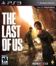
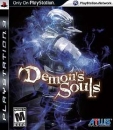
Kinetica, God of War, Journey, Hohokum, and The Order: 1886 — these are just a few examples of our studio’s strong internal and external legacy encompassing a broad spectrum of innovative and diverse titles. As we at Santa Monica Studio continue our odyssey to develop great games for PS4 (No hints!) both with our internal studio and our external dev partners, it seemed befitting to seek out a new unified studio logo. The goal — create a flexible identity for all of our games, a united banner for all we do.

Over one year ago, the creative process of developing our new studio logo began, bringing together team members across different departments of our studio to collaborate and engage in this journey. When you think about establishing a new brand identity, it is about more than an image, it is our promise to our fans that we will continue our tradition of inventive and exceptional games. Now, one year later, we are proud to reveal a logo that celebrates all of our games.
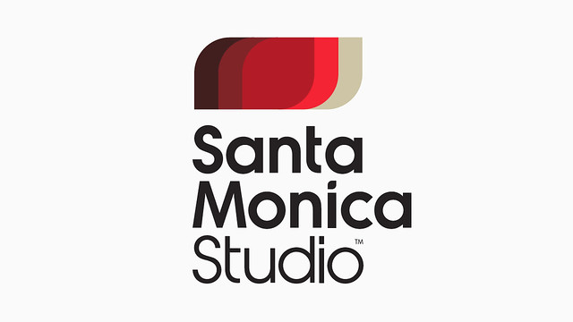
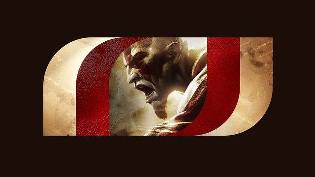
As you look upon this new emblem, though subtle the design may be at first glance, one cannot help but be pulled in to the compelling intricacy of its facets – our new logo is a dynamic ‘window’ into our games. The games we create at Santa Monica Studio become the very essence of who we are as a studio, and vice versa. Our games are the studio’s brand, and now our logo exemplifies who we are.
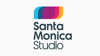

Our new logo, with its bold, simple structure can become a frame to the world of our games, filled with elements of the game such as key colors, textures, game content and screenshots. When you see the new animated logo boot up with our next external dev games such as Fat Princess: Piece of Cake and Hohokum, you’ll further understand how we crafted a mark that allows our games to visually become part of the brand.
The typography of our new logo is a custom designed font we’ve coined SMS “Vanguard.” It means a group of people leading the way in new development or ideas. As we leave our home of 15 years at Penn Station, and move in today to our new creative home, The Reserve, the very core meaning of our new logo takes on even more significance. We have an incredible future ahead for a new generation on PS4 under this new roof and with our external partners. Now we have a mark that will continue to evolve and expand with every new game from Santa Monica Studio.
To learn more about our new studio and happenings, visit our official site at sms.playstation.com or follow us on Twitter @SonySantaMonica!