By using this site, you agree to our Privacy Policy and our Terms of Use. Close

Forums - Nintendo Discussion - Wind Waker looking considerably uglier on HD

What's the point of remaking Wind Waker with worst graphics? HD surely does not go well with cell shading
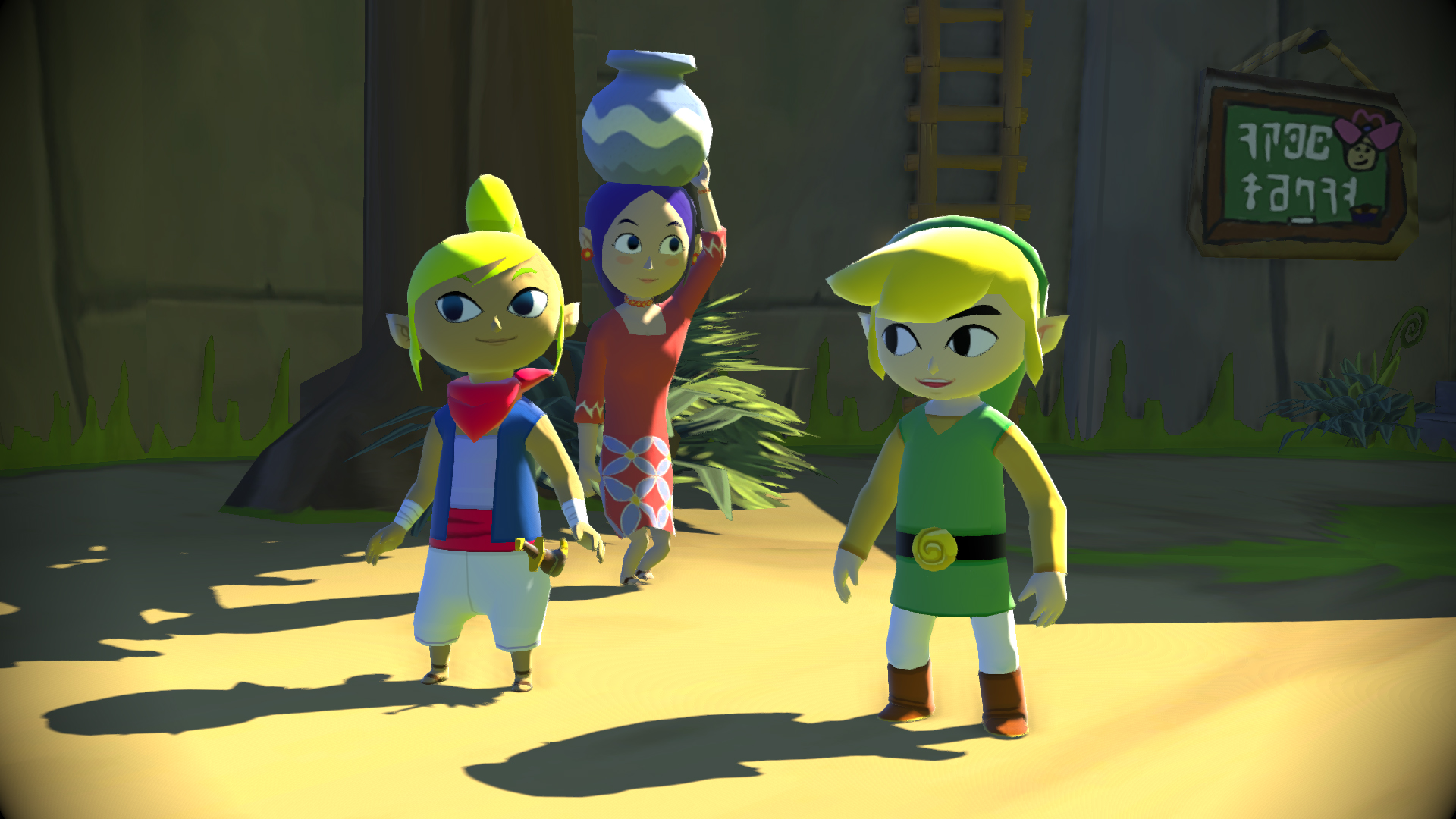
Wii U:


Gamecube :


The Wii U version just looks plastic....


I surely won't trade my GameCube collector edition for a plastic version of WW.


Around the Network

I'd say more like clay. I have mixed feelings about the new style but I sure as hell do what to play WW again.

(Sold mine when I was young and idiotic)


http://gamrconnect.vgchartz.com/profile/92109/nintendopie/ Nintendopie  Was obviously right and I was obviously wrong. I will forever be a lesser being than them. (6/16/13)

That second screen you posted for WW on Wii U ain't for Wii U. Only the first picture from Wii U is actually on the Wii U.

And I think it looks awesome!! Zelda fans are just a bunch of crying bitches whom never is satisfied with the direction of the series. I remember when WW was released and no one liked what they saw - and nowadays... It's almost as much loved as OoT...


I'm on Twitter @DanneSandin!

Furthermore, I think VGChartz should add a "Like"-button.

Otakumegane said:
I'd say more like clay. I have mixed feelings about the new style but I sure as hell do what to play WW again.

(Sold mine when I was young and idiotic)

Agreed. It looks a little like those Christmas claymation movies in that still.

@OP: It's a really tough act to follow. Wind Waker has arguably the best art direction of any Zelda game. Still, like Otaku, I'm eager to see what it plays like.


Nintendo doesn't want to make HD remakes like Sony does (just upscaling to 1080p). Sure it looks different but I want to see it in motion first. I think it can be gorgeous in 1080p/60fps.


Around the Network

From those screenshots the Wii U version looks significantly better.


Look at the forest on top of the mountain, I expect more from a HD console

edit: you removed the picture I was talking about


Should have gone to Specsavers. 2 for 1 on a brand new pair of glasses.


Wii U Nintendo Network ID, Borode

XBOX Live ID, Borode

Its not that it looks worse on HD, it's that the shading makes it look a bit different.  We'll see how it turns out.  I'm looking forward to hd-widesceeen windwaker.


The main problem with the Wii U artstyle is that the character looks like balloons filled with air.

The Gamecube version lacks the high definition, but the art style is perfect. The cartoon graphics set an univers completely coherent and colorful.

The Wii U graphics does not allow immersion in the universe, it looks too much artificial.