By using this site, you agree to our Privacy Policy and our Terms of Use. Close

Forums - Nintendo Discussion - Windwaker best graphics and art style of all time

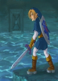
fillet said:
It looks good because it's cell shaded, there's nothing clever or special going on there.

Cell shaded graphics by nature are scalable with no aliasing and hence look great and will do in the future, if completely devoid of any detail.

It's as silly as saying Virtua Fighter 1 non-remix looks better than Virtua Fighter 1 Remix because the textures don't scale well but the non textured poly models of the original when scaled up on an emulator look very good, simple chunky but nice and crisp.

Same goes for all Sega Model 1 arcade games...


I agree with this.  Even when the game first came out I wasn't impressed by the art style.  And on top of it, WW didn't seem like a true Zelda experience to me.  I felt like it always should have been called, Zelda Jr... it wasn't a bad game, but it wasn't (and still isn't) the type of gaming experience I look for.

I can understand completely why so many people still love it even to this day.  It upscales beautifully, and it has a sort of kiddie charm that a lot of gamers like.


Around the Network

To be honest, i like it and i wish Nintendo would remake the DS games on the 3DS with wind waker quality graphics and actual action gameplay and not that crap stylus only controls. That really annoyed me.


Altenatively, a new game with wind waker graphics but an older link and completely new would work very well aswell.


Disagree. I can think of a number of games that did the art-style much better. also another one on the way.


4 ≈ One

The thing about your opinion is kind of wrong because games literally look better now, and it's fact on what the best console looking console not opinion. You can't bring opinion into facts and technicalities, you could say that you liked it the best because of it's Pixar/Disney look.


Not that good to be best of all time.


Around the Network
wfz said:
I definitely enjoyed not only the art style and graphics of Wind Waker, but the animation styles that all the game employed that fit really well with the visual style.

totaly agree.  Best art style of art style : nintendo proove that technologies is not the only thing important when it come to make beautiful game.


blkfish92 said:
The thing about your opinion is kind of wrong because games literally look better now, and it's fact on what the best console looking console not opinion. You can't bring opinion into facts and technicalities, you could say that you liked it the best because of it's Pixar/Disney look.


"Best-looking" is a judgment formed by one's opinion.  More polygons, etc. is something that can be argued based on facts.  But when taking art style into account, then what looks best to someone has everything to do with one's visual preference(s).

For example, I believe Mortal Kombat 3 looks better than Mortal Kombat 4, regardless of the fact that MK4 was built on a more powerful engine, and required better CPU and GPU processing.  MK4 was more techinically evolved and still looked worse.  This has been my opinion of which game is better-looking.

But back to the point of this thread, I stand firm by my opinion that Windwaker is not one of the best-looking games of all-time.


When this game came out my brother and I were very divided. He borrowed a GameCube to play it, I didn't have an opportunity to play it so I can't say anything about gameplay/story but this isn't about that. I strongly disliked the graphics and to a lesser extent the art. Windwaker is the example of games I choose to example bad cell shading. Cell shading has come a long way since then and has produced some great looking games, but in the early days like with Windwaker, cell shading was void of detail. Colors covered large spaces and touched eachother without pleasant transition with movement. Shadows were ugly, darkening colors flatly on surfaces making it look more like the colors were glitching from dark to light more than actually displaying a shadow effect, atleast when movement was involved.

Cell shading looks hundreds of times better today; more detail, better shadow effects, and a wider array of colors. I've played about half of Phantom Hourglass and that game looks better than Windwaker. Early cell shading just looked bad. This is obviously opinion, but if you look at the modern examples of Cell Shading how can you attribute Windwaker as having the best? If anything, its one of the worst. Perhaps your appreciation of the games stems from the game itself, how much fun you had, the story, the world, or even how much you liked the graphics back then. Just because something is new and different doesn't make it better, it helps though. To me Windwaker never looked good, I felt it looked like a blotchy mess of solid color, like playing a game of a children's coloring book with only 3 crayons and half of the lines missing.....ooooh that's a good one, I should have told my brother that back in the day, lol.


Before the PS3 everyone was nice to me :(

I agree with you, Wind Waker forever!!!


Wind Waker did look pretty damn good and still looks impressive today... it was like playing a fully interactive cartoon.

Now if only they didn't make Link and some of the other characters look like Powerpuff Girl rejects.  It would be killer if they had modeled Link and the other characters based off the classic hand drawn Zelda artwork from the first three games...


On 2/24/13, MB1025 said:
You know I was always wondering why no one ever used the dollar sign for $ony, but then I realized they have no money so it would be pointless.