By using this site, you agree to our Privacy Policy and our Terms of Use. Close

Forums - Nintendo - Take a Pik June 5-7 & Wii U Box Arts

The Idea was to make a very clean box art with no banner taking up space.

check out the the others here:  http://theredflip.blogspot.com/2012/02/i-made-some-custom-wii-u-boxarts.html


Around the Network

I know these box arts are all fake... but is Timesplitters 4 still actually in development?!?


On 2/24/13, MB1025 said:
You know I was always wondering why no one ever used the dollar sign for $ony, but then I realized they have no money so it would be pointless.

No! :(

instead Crytek put the for free radical guys to work on homefront 2 for 2014......


Damnit I was about to ask that.

I think I'll buy TS:FP.... although it's still £20!


As for the boxarts, not bad... though in terms of "clean" looking I don't have a problem with there being a console banner on them, in fact I think they help give a more consistant look for a game collection. It's the ESRB and other logos on it that make them look cluttered to me.

EDIT: actually i'm guessing you designed these and would like a critique, well ignoring said issue with logos here are my thoughts:

The pikmin advert: I assume it's meant as a general advert (something that might be altered a little to fit online ads or physical posters and such), I like it... simple and clean but effective. The only thing I don't like is the WiiU logo placed onto the console itself, I think it would have looked better in the top right or bottom left. (I'm guessing you shopped the console itself to make it look grey btw... as I don't think i've seen a grey/silver WiiU pic)

Skyfall: The art is good, I think the bond silhouette should be bigger though, and the text smaller (it definately is too close to the edges of the box for my liking)

TS4: Not really a big fan of that tbh (apart from the subject matter)

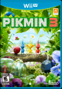
Pikmin 3: Generally good, but while going for clean designs might be your goal, having such a busy texture with so many characters on it doesn't work well on a plain white background. Also the green in the logo doesn't match your grass effect, which is a shame because that's a nice grass effect you made. (I'd advise altering the vibrancy of the pikmin logo to try and match your grass colour)

Aliens: Really nice... again I have the feeling there should be something other than a plain white background, but it still works for me.


The silver U and all the box arts look awesome :)


Around the Network

Metallic Wii U???


I just added my views on your work here to my previous post. I'll have a look at the others on The Red Flip and give you my views tomorrow if you like.


TWRoO said:
I just added my views on your work here to my previous post. I'll have a look at the others on The Red Flip and give you my views tomorrow if you like.


Yes that would be great. oh and the alien box art is actually the official box art.......art. lol


spurgeonryan said:
ECC said:
TWRoO said:
I just added my views on your work here to my previous post. I'll have a look at the others on The Red Flip and give you my views tomorrow if you like.


Yes that would be great. oh and the alien box art is actually the official box art.......art. lol


So the nintendo network symbol is really on the box?


no no just that the art is the official box art for the game. the n network logo was me as was the wii u.


i think something like this would be nicer


    R.I.P Mr Iwata :'(