By using this site, you agree to our Privacy Policy and our Terms of Use. Close

Forums - Nintendo Discussion - Legend of Zelda Skyward Sword Visuals Yay or Nay?

Something more noticeable in this shot than in others (just right click, View Image):

Notice how when you look into the distance, the watercolor effect becomes more and more pronounced, until it's like the background actually is a painted world? That's pretty cool.


Around the Network
andremop said:

I really liked... to me that was the perfect style.

A mix between cartoony and realistic with a little bit of artistic (characters look water painted).


I agree with this guy,they look like beatifully water color paintings,like a dream what the Zelda franchise is,a majestic dream.The mix of real and cell is creative for sure.


^^^Yea. With the issues that occured during the presentation, we didn't get a chacne to really look at the game.

Plus, the level is a bit basic, like, you know tutorial stage Mario with that one Goomba to start you off. There is tons more and now that I get a closer look, Link looks awesome and I can't find a jaggy on one character lol


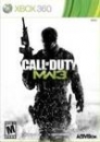
Leatherhat on July 6th, 2012 3pm. Vita sales:"3 mil for COD 2 mil for AC. Maybe more. "  thehusbo on July 6th, 2012 5pm. Vita sales:"5 mil for COD 2.2 mil for AC."

Khuutra said:

Something more noticeable in this shot than in others (just right click, View Image):

Notice how when you look into the distance, the watercolor effect becomes more and more pronounced, until it's like the background actually is a painted world? That's pretty cool.


Wow, great catch! Cartoony Realistic Artistic = Epic Zelda Win


Still a 2011 year release so they have time to tweak things up a bit.


If it isn't turnbased it isn't worth playing   (mostly)

And shepherds we shall be,

For Thee, my Lord, for Thee. Power hath descended forth from Thy hand, That our feet may swiftly carry out Thy command. So we shall flow a river forth to Thee And teeming with souls shall it ever be. In Nomine Patris, et Filii, et Spiritūs Sancti. -----The Boondock Saints

Around the Network

Khuutra, the pics shown really do look quite nice. I'm warming up to the art style. I think the initial shock of it not being what I expected is wearing off. Good catch on that last shot. Some of the high quality vids make the game look very fluid.


Bet between Slimbeast and Arius Dion about Wii sales 2009:


If the Wii sells less than 20 million in 2009 (as defined by VGC sales between week ending 3d Jan 2009 to week ending 4th Jan 2010) Slimebeast wins and get to control Arius Dion's sig for 1 month.

If the Wii sells more than 20 million in 2009 (as defined above) Arius Dion wins and gets to control Slimebeast's sig for 1 month.

I love it, I can't wait to play it. I think the game looks wonderful in motion and screen shot, really dig the art style. 


I like the art style overall.  But I'm not blown away like I was with Wind Waker Twilight Princess (on GameCube). I just hope they'll had some detail to the environment, because they look flat as of now.  I really appreciate the blurring in the distance occuring.  As has ben pointed out already, it makes it look like a watercolor painting.

Link's model is really good too.

Not really fond of the enemies new designs though. They kind of look bland compared to what was in Wind Waker.


If it was me, I would have gone for a Wind Waker art style, but with adult Link and a darker color palette (as in: no exagerated and over-saturated primary colors.).


But of course, the game's still a long way to go, so I'm sure they'll improve what they've already laid out.


Im a little bit suprised honestly. judging from the illustration they released months ago, I thought they were going to release a game like twlilight princess with better visuals. It still looks really good though. They have the rest of the six months for this year to polish it up and fix the kinks.


Nay....